
Virtually all of my paintings come from my personal experiences. Ghosts of the Old South was inspired by a stop at Sheme Creek boardwalk near Charleston, SC. The abundance of moss draped over tree branches and waving in the southern breezes is something we don't see up north.
I was also excited by the value contrast of the light colored moss and the dark background. There were several Snowy Egrets in the marsh and I had an opportunity to photograph them as well. Another lesson on values. The bright white egret will stand out well against this background.
.
To help me solidify my concept, I develop a value sketch. This is a small pencil drawing of gray values to help me see the placement of lights, darks and mid-tones that will contribute to a good design.

Although the inspiration of the painting is the moss, the focal point will be the egret. I generally use the rule of thirds and have positioned the bird one third the length of the paper in, from the right edge and one third up from the bottom, give or take a little.

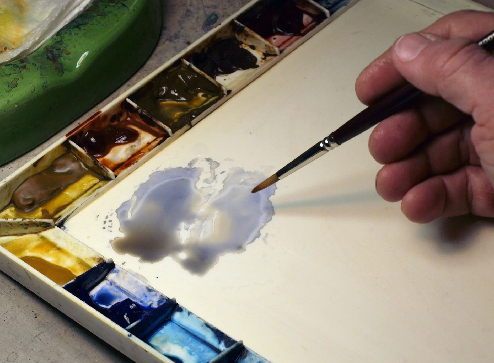
In today's world of digital photography, we have the ability to crop, enlarge and print our photographs from our computers at home in a matter of minutes. After reviewing a collection of shots of the egret, I made an enlargement of this one to use as my subject.
I'm old school, expect to always be. As tempting as it is for some, I'm not one to trace from a photo. I draw my subjects free hand. I find tracing like using a ruler, too mechanical, too rigid. I may draw my subject several times and engage the eraser until I feel I have a satisfactory image by my hand.
The trick is to get that exact image onto the watercolor paper. To accomplish this, I trace my image onto tracing paper (below, left). Next (below, middle), I turn the tracing over and retrace the image using a soft pencil. Last, I turn the sheet right side up and place it in the exact position on the watercolor paper and carefully retrace the image again. The soft pencil on the back of the tracing acts as a carbon , transferring the image onto the watercolor paper.


Using my photographs of the marsh landscape, I draw in the other elements I feel are necessary to help guide me through the painting.
It's not necessary to draw in every detail. To much drawing traps you into placing paint in exacting areas and it can begin to have a coloring book appearance. Think shapes and draw in forms and mass. A tree trunk with the main branches to designate placement is fine but don't draw every little branch.
Once the first wash is completely dry, I begin to add more shadows using the same cool color mix. Layering transparent watercolor is like placing stained glass sheets one in front of another. Although the colored area becomes darker, it remains transparent, allowing the initial color wash to show through subsequent washes. This is part of the beauty of watercolor, the passing of light through the layers of color to the paper and reflecting those colors back to your eye. It is known as "luminosity".
The subsequent layered washes are applied and edges softened with minimal strokes to minimize the disturbance of the previous wash.


I generally paint light to dark in watercolors. I start with the egret and give it a wash of both cool and warm tones. The warms represent the warm reflected light from the marsh grass and the cools represent the shadows. Although you may see gray shadows, I use a little more blue in my mix to make the white shadows cleaner, less dirty.

I'll return to the egret later. It's time to apply light tones to the background.
I start by putting my first tones in the lightest areas, the moss. Remember, I'm build to the mid-tones and eventually darks. I add darker variations of the moss colors, building it as I'm building values on the egret.

Once I've blocked in the different colors of the background foliage, I want to begin to define leaves. Again, because we paint light to dark, I need to paint darker colors around leaves in order to leave the foliage a lighter color.
That could be a lot of painting over a long period. In this instant I'll engage the sponge. There are many different types of sponges. I find the natural sponges to work the best. What ever you decide, practice first!
What we are painting is the area around the leaves so you want a less dense sponge that leaves more open space. I dampen the sponge, sqweezeing as much water out as possible. I then dip it into my mixed puddle of paint and gently touch it to the paper in a rolling fashion. Grab some more paint and repeat being sure you turn the sponge and roll in a different direction to avoid a "wallpaper pattern".


Add additional mid-tones layering color onto color as you deepen values overall. Finally, add the darks. These can be layered as well to achieve your greatest value contrast which will make the painting pop!


Continuing on, I add a light wash of warm tones to the foreground. These will become marsh grasses. They will be built in the negative painting method as I did with the grasses in the "Swimmin' Can Be Dangerous" demo.
Below, I develop mid-tones. These help to define the edges like the tree foliage, foreground grasses and the egret.


Ghosts of the Ole South by Dan Meyer